Tuesday, 10 November 2015
Monday, 9 November 2015
Sunday, 8 November 2015
Saturday, 7 November 2015
Friday, 6 November 2015
Thursday, 5 November 2015
Wednesday, 4 November 2015
Tuesday, 3 November 2015
CONSTRUCTION - ALBUM ART
To conform to the indie genre, and the style of our song, we decided that our Digipak Design should be simplistic. We also felt that the Digipak should look as if it was home made, to match the garage and independent DIY nature of the indie-rock genre. Rather than having the product look too homemade and scruffy, we decided that there should be elements of professionalism and conventions that allude to the indie-rock genre. After researching a variety of album artwork for bands of the indie genre, we decided that the album art we liked the best was that of Blur: The Best Of, which utilised cartoon faces of each member of the band.
Our inspiration drew heavily from that album, as we decided we would incorporate a cartoon element to our album art, while still maintaining the 'DIY' aspect of the genre. We also felt that this would be a good idea as the album artwork would create synergy between the art and the music video, which is comprised entirely of band shots, and also align with the conventions of the indie genre of the attention being centred heavily around the band, allowing fans to establish a sense of connection between the band members. The first step in creating the album artwork was to design and create the cartoon faces for each member of the band, using Adobe photoshop CS5, which is demonstrated in the following Youtube video.
Our inspiration drew heavily from that album, as we decided we would incorporate a cartoon element to our album art, while still maintaining the 'DIY' aspect of the genre. We also felt that this would be a good idea as the album artwork would create synergy between the art and the music video, which is comprised entirely of band shots, and also align with the conventions of the indie genre of the attention being centred heavily around the band, allowing fans to establish a sense of connection between the band members. The first step in creating the album artwork was to design and create the cartoon faces for each member of the band, using Adobe photoshop CS5, which is demonstrated in the following Youtube video.
Monday, 2 November 2015
CONSTRUCTION - EDITING
The Program we used to edit was Final Cut Pro
Editing took a long time because we had to make sure that each shot of the singing or the playing of the instruments was in sync with the song. We started by putting the song into a blank project, watching the raw footage and placing in pieces of our singer, and using that a the base for our finished product.
We did encounter some problems, which are explained in this video:
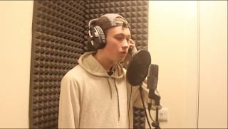
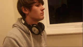
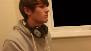
the following images are how the shots looked in the raw footage, and how they looked after we edited them.


Sunday, 1 November 2015
CONSTRUCTION - FILMING
We filmed our footage over 3 days. We had a few problems with the availability of some of the members of our 'band', and this was made clear as we had to step in and play an instrument each.
When we started filming, we felt that the lighting in the room was too white. we felt it looked very clean and didn't fit the genre we were going for. we didn't have enough filters of the same colour we desired to cover every light, so instead, we put the filter over the camera, which filtered every colour in the room. we put this on with sticky tape and it held very well. It did not ruin the quality of the shot, or put it out of focus.
We felt that using a range of angles was very important. the rooms in which we used to film were very small, so it was hard to get many angles. There was not room to stand on something in order to get very high shots, so we tried holding the camera, attached to the tripod, above our head. When we watched it back we found that the camera was very unstable, so the shots did not look very good. The shot itself did not fit in to the video anyway, so we probably wouldn't have used the shot, even if it was stable.
Subscribe to:
Comments (Atom)


